
This guide is for the people who run the site: site builders, content editors, communications staff. You don't need to know Drupal's internals, and you won't touch code. If you can edit a document and drag a file into a folder, you can build pages with Jarvis.
What this guide is not: It's not a developer guide. If you want to know how Jarvis is built, or build a theme like it, read The Jarvis Technical Guide. Screenshots in this guide come from DrupalHelps.com, a live Jarvis site. Your menus, colors and some fields will differ. The screens and buttons won't.
Contents
- Install a fresh Jarvis site
- Two ways content gets built
- A tour of the Canvas editor
- Build a page, step by step
- Pick the right component
- Blog posts and Basic pages
- Templates: change every post at once
- Images, documents and video
- Menus
- Your brand: colors, fonts and logo
- Forms, sharing and search
- Accessibility: your part
- When something looks wrong
1. Install a fresh Jarvis site
Skip this chapter if someone already set up your site. It's for when you want your own Jarvis site on your own computer, to learn on or to start a new project. It takes about 15 minutes, and most of that is waiting for downloads. It's also the only chapter where you type into a terminal.
You need 2 things installed first: Docker (Docker Desktop, OrbStack or Colima) and ddev. ddev runs Drupal inside Docker, so you don't install PHP, a database or Composer yourself.
Paste one box at a time: Open a terminal, copy a whole box, paste it and press Enter. The lines run in order. Wait until the last one finishes before you paste the next box, and use the same terminal window throughout. Every line fits on one line of the page, so if a line pastes as 2, it was copied wrong.
Create the project and download Drupal. Replace
mysitewith your project's name first.mkdir mysite && cd mysiteddev config --project-type=drupal11 --docroot=webddev startddev composer create-project drupal/recommended-project:^11Tell Composer where Jarvis lives. Jarvis isn't on drupal.org yet, so Composer gets it from GitHub. The first line makes Composer download from GitHub directly, so it never asks you for a GitHub token. The second saves the GitHub address so the rest stay short.
# Runs locally (host shell). GH is just a shortcut variable for the repo URL prefix.GH=https://github.com/imrodmartinddev composer config use-github-api falseddev composer config repositories.jarvis vcs $GH/jarvisddev composer config repositories.jarvis-modules vcs $GH/jarvis-modulesddev composer config repositories.jarvis-recipe vcs $GH/jarvis-recipeDownload Jarvis and everything it needs. The first 2 lines allow 2 test releases that Jarvis uses. This is the long one.
ddev composer require drupal/default_content:^2.0@betaddev composer require drupal/ai_media_image:^1.0@alphaddev composer require drush/drush drupal/ckeditor5_markdownddev composer require imrodmartin/jarvis-recipeInstall Drupal, apply the Jarvis recipe, and log in. The recipe turns on Canvas and the theme, and adds the demo pages, menus and forms. The last line opens the site in your browser, signed in as
admin.ddev drush site:install standard --account-name=admin -yddev drush recipe /var/www/html/recipes/jarvis-recipeddev drush cache:rebuildddev launch $(ddev drush user:login)
Run the recipe on a new site only: This recipe replaces your theme, your front page and your menus. Never run it on a site that already has content. To add Jarvis to an existing site, use the Jarvis install recipe. It adds the theme and changes nothing you already had.
The rule: A fresh site gets the Jarvis recipe. A site with content gets the install recipe.
2. Two ways content gets built
Everything on a Jarvis site is built one of two ways, and knowing which one you're in saves most of the confusion new editors run into.
Canvas pages
Content items
What they are
One-off pages you design visually
Blog posts and Basic pages you fill in with a form
Examples
Home page, landing pages, a training overview, a product page
Every blog post, an accessibility statement, an about page
Where you edit
The Canvas editor: drag, drop, set options
The edit form: title, body, image, fields
Where the look comes from
The page itself. You arrange every section.
A template shared by every item of that type
The template is the part people miss. When you write a blog post, you don't design it. You fill in the fields, and the Blog template decides where the image goes, where the date sits and how the share buttons line up. Change the template once and every post changes with it. That's chapter 7.
The rule: If it's a one-off page, build it in Canvas. If you'll write 50 of them, it's a content item.
3. A tour of the Canvas editor
Canvas is Drupal's visual page builder. You see the page as visitors will, and you build it by dragging components onto it. Open any Canvas page and you'll see 4 areas.
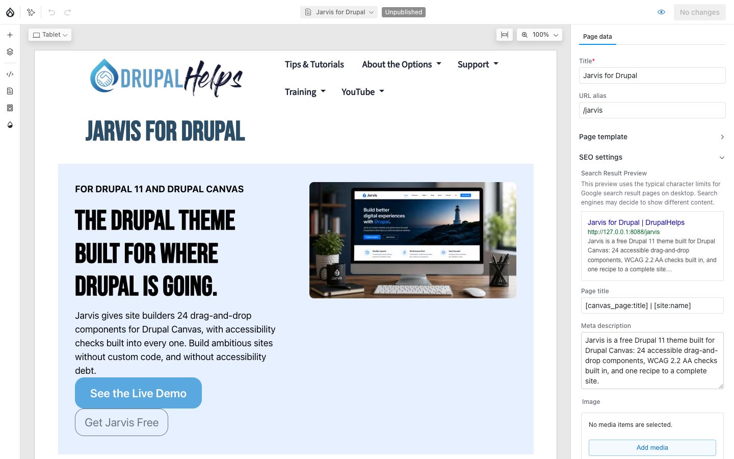
- The top bar. The page's name and status (Published or Unpublished) sit in the middle. On the right are Preview (the eye icon) and the publish button, which reads No changes until you edit something. The Drupal icon at the far left is Exit Drupal Canvas, back to the admin.
- The tool rail on the left. Library (the plus sign) holds every component you can add. Layers shows the page as an outline. Pages lists your Canvas pages, and Templates holds the content templates. This guide doesn't cover Code or Brand kit, which are for developers and designers.
- The preview in the middle. Click anything on the page to select it. The size menu at the top left switches between Desktop, Tablet and Mobile, so you can check every screen size before you publish.
- The settings panel on the right. With nothing selected, it shows Page data: the title, the URL alias and the SEO settings. Select a component and it shows that component's settings instead.
Canvas saves as you work. Nothing you do reaches visitors until you publish it, so you can experiment freely.
The rule: Left rail to find things, middle to arrange them, right panel to set them.
4. Build a page, step by step
Create the page
- Open Canvas and click Pages in the left rail.
- Click New and choose New page.
- In Page data on the right, set the Title and the URL alias, for example
/training. - Open SEO settings and write a Meta description: 1 or 2 sentences that make someone want to click the result in Google.
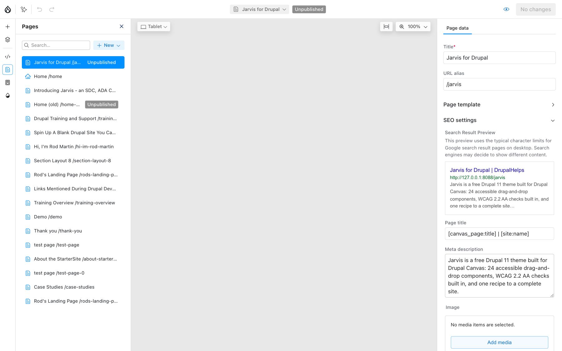
Each page in the list has its own menu with Duplicate page, Set as homepage and Unpublish page. Duplicating a page you like is the fastest way to start a new one.
Start with a section
Every page is a stack of sections, and every section is a layout component. Build the layout first and fill it second.
- Click Library in the left rail. Components are grouped into folders.
- Open Sections and drag 2 Columns onto the page.
- Open Content and drag a WYSIWYG into Column 1 and an Image into Column 2.
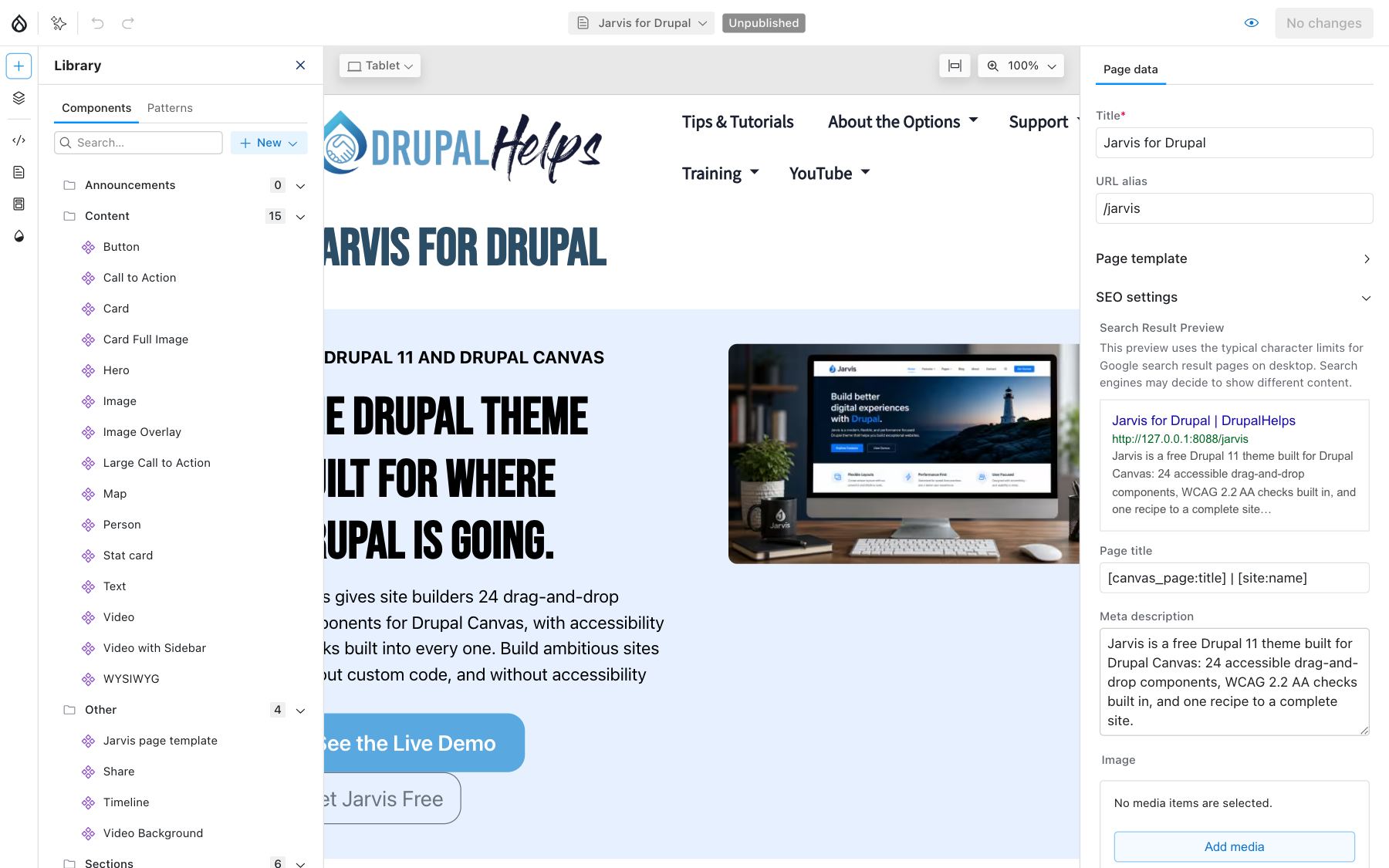
Columns stack on phones automatically. A 3 Columns section shows 3 across on a desktop, 2 on a tablet and 1 on a phone. You don't set anything for that to happen.
Set a component's options
Click a component on the page, or click its name in Layers, and its settings open on the right. Every field there is labeled in plain language: Title, Image, Heading level, Background, Padding.
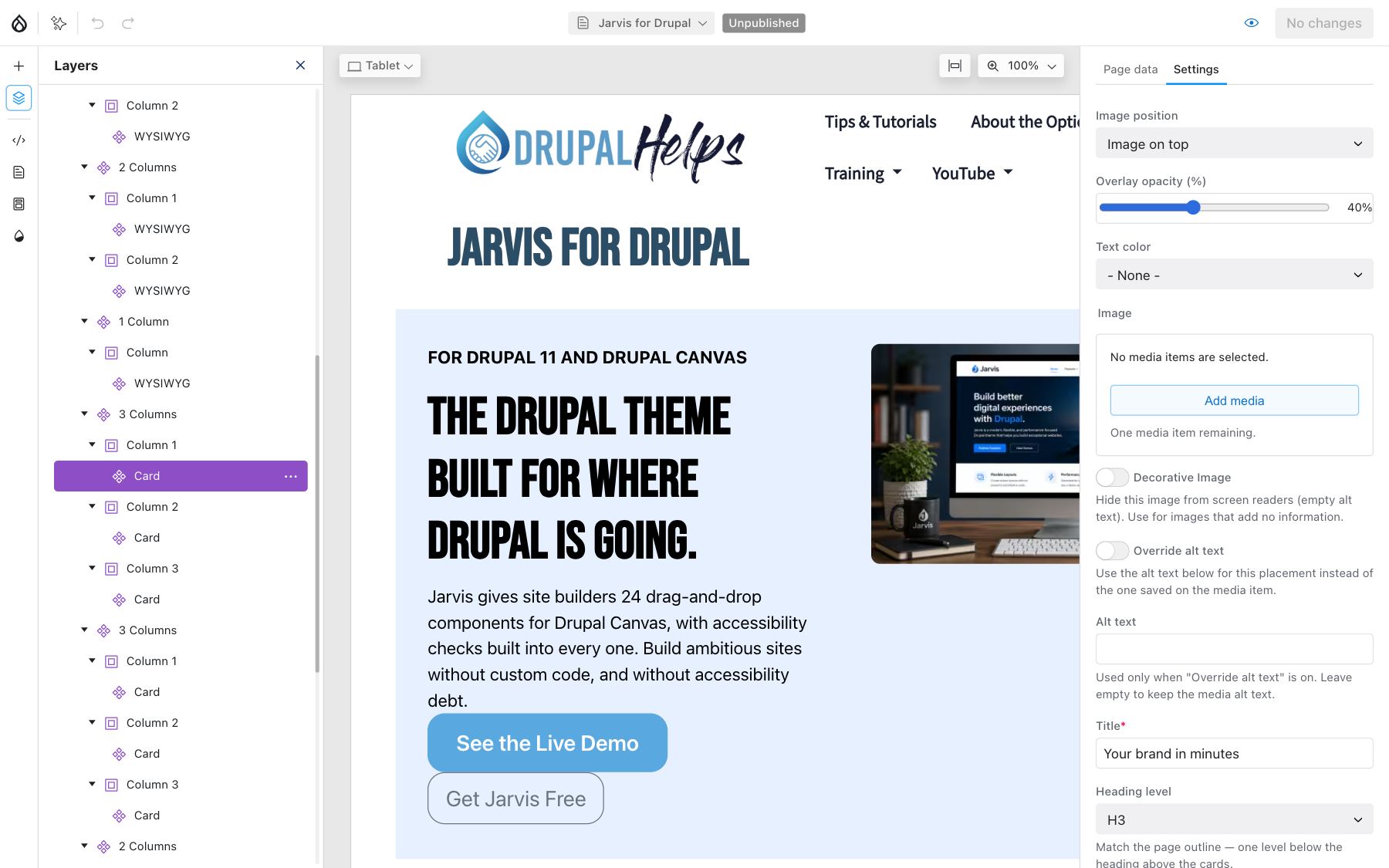
Layers is also the easiest way to work with a long page. Drag items in the outline to reorder them, or right-click a component for Duplicate, Copy, Paste, Move up, Move down and Delete.
Save sections you reuse as patterns
Built a section you'll want again, like a row of 3 cards with a heading? Right-click it and choose Create pattern. It appears under the Patterns tab in the Library, ready to drag onto any page.
Preview, then publish
- Click Preview and check the page at Desktop, Tablet and Mobile.
- Click the publish button at the top right. It now reads Review 1 change, or however many changes you've made.
- The Unpublished changes panel lists everything waiting to go live. Tick what's ready and click Publish selected changes.
Changed your mind? Discard changes in the same panel throws the edits away and puts the page back the way visitors see it.
The rule: Nothing is live until you publish it. If a visitor can't see your change, check the publish button first.
5. Pick the right component
Jarvis ships 24 components, filed into 3 folders in the Library. You'll use 6 of them most of the time: 2 Columns, 3 Columns, WYSIWYG, Image, Card and Button. The rest are there when a page needs something specific.
Sections: the layout
Component
Use it for
Section
A plain wrapper for one band of content
1 Column
A single column with a background color or image
2 Columns
Text beside an image, or 2 cards side by side. Ratios like 50/50 or 66/33.
3 Columns
A row of 3 cards, stats or people
3 Columns (custom widths)
A content area with a sidebar. Set each column's width, and a column at 0% disappears.
4 Columns
4 short items: stats, logos, small cards
Every section has the same core options: Width (boxed or full), Background (a brand color or an image), Text color, Gap, Padding and Margin.
Content: what visitors read
Component
Use it for
WYSIWYG
Rich text with headings, lists, links and embedded media. Your everyday text block.
Text
Rich text with control over reading width and alignment
Hero
A full-width banner: heading, subheading, a button and a background image
Card
Image, title, short text and a link, with the image on top, left, right or behind
Card Full Image
A band with an image filling one half and text in the other
Call to Action
A centered heading, a line of text and one button
Large Call to Action
A bigger pitch: heading, lead text, 3 icon rows and 2 links
Stat card
One big number with a short description
Person
A portrait, name, role and contact details
Button
A standalone button, when nothing else on the page carries one
Image
A single image, with an optional caption
Image Overlay
An image with a colored text card in the corner
Map
A Google map from a one-line address
Video
A YouTube, Vimeo or uploaded video, with captions
Video with Sidebar
A video beside a title, description and buttons
Other
Component
Use it for
Timeline
Up to 6 steps or questions, shown as tabs, an accordion or a vertical rail. It makes a good FAQ.
Share
Share buttons for the page: Facebook, X, LinkedIn, Bluesky, Reddit, email and copy link
Video Background
Video playing behind a text card
Your site can also place blocks from the Library, like the Webform block or the 3-card Blog block. They work like any other component.
The rule: Start with a section, then fill it. A component dropped straight onto the page has nothing to hold it in line with the rest.
6. Blog posts and Basic pages
Blog posts and Basic pages are content items. You don't design them. You fill in a form, and a template does the layout.
Write a post
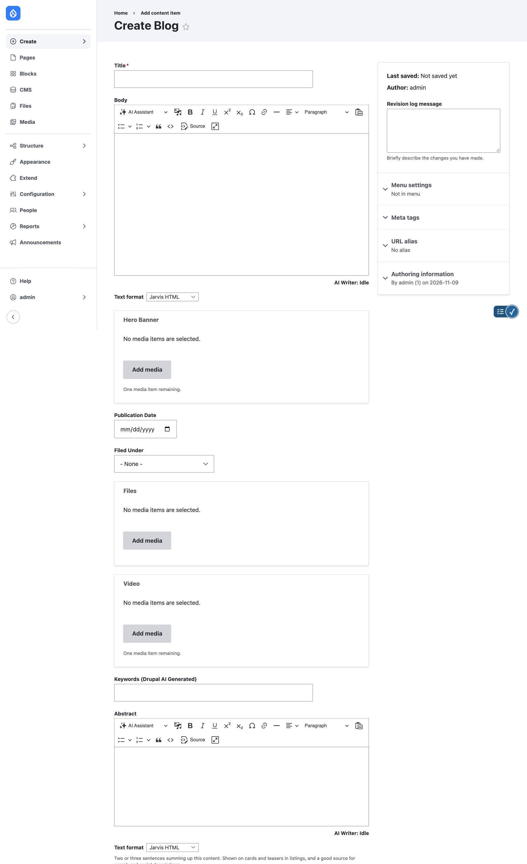
- Go to Content and click Add content, then Blog. The Create menu in the admin sidebar gets you there too.
- Fill in the fields below.
- Leave Published ticked to go live, or untick it to save a draft, then click Save.
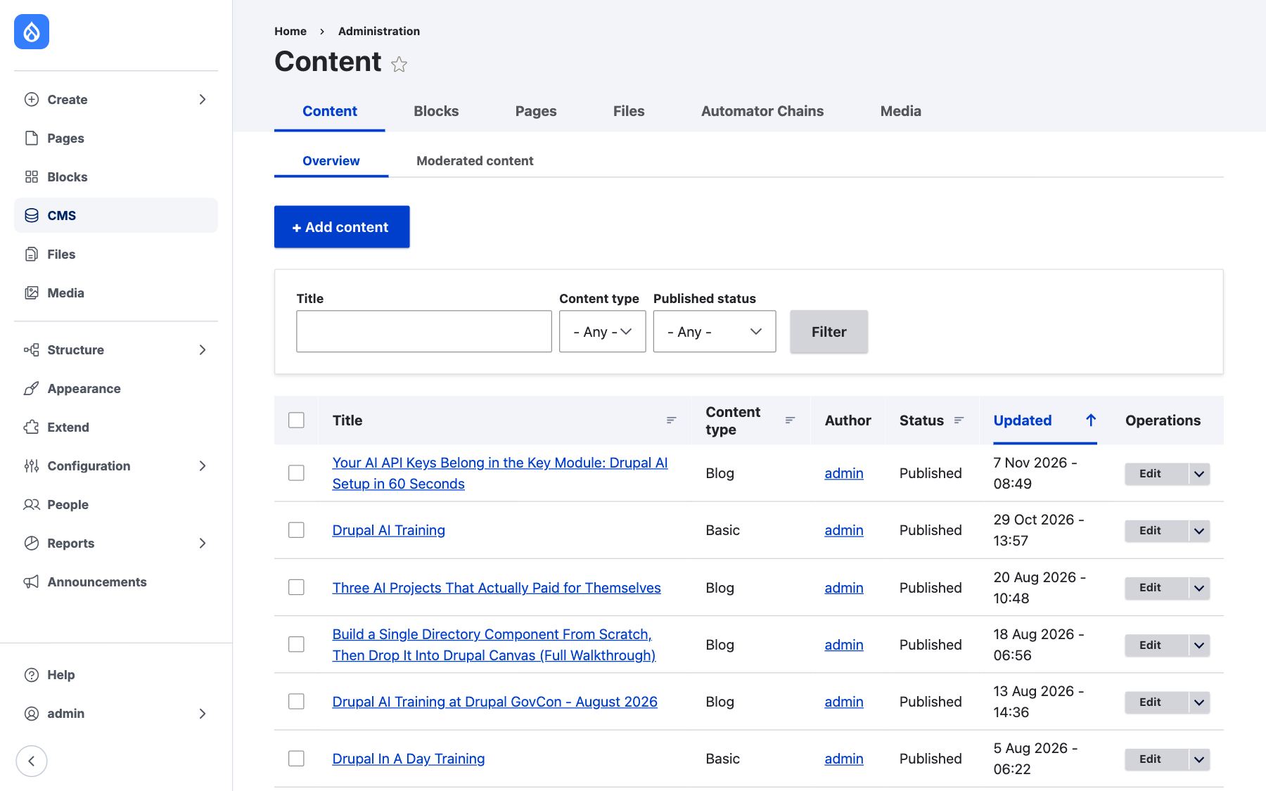
Field
What goes in it
Title
The headline. It's also the page's main heading and the title search engines show.
Body
The post itself. Use real headings from the Paragraph menu, not bold text.
Hero Banner
The main image, picked from the media library. It leads the post and its card.
Publication Date
The date shown on the post and its card (Blog only)
Video
An optional video for the post (Blog only)
Abstract
2 or 3 sentences that sum the content up. It's the text on cards and teasers.
URL alias, Meta tags, Menu settings
In the sidebar: the address, the search description and an optional menu link
Why the Abstract matters
Listings don't show your body text. They show cards, and every card shows the Abstract. A post without one gets a card with an image, a title and nothing else.
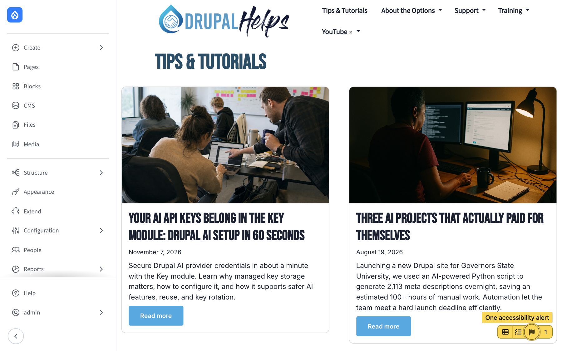
Write it for a reader deciding whether to click: what the post covers and why it's worth their time. If your site has AI configured, the Abstract can be drafted for you. Read it before you publish anyway.
The rule: Write the Abstract last, when you know what the post actually says.
7. Templates: change every post at once
Every content type has templates, and each template controls one way the content is shown. Change a template and every item of that type changes the moment you publish.
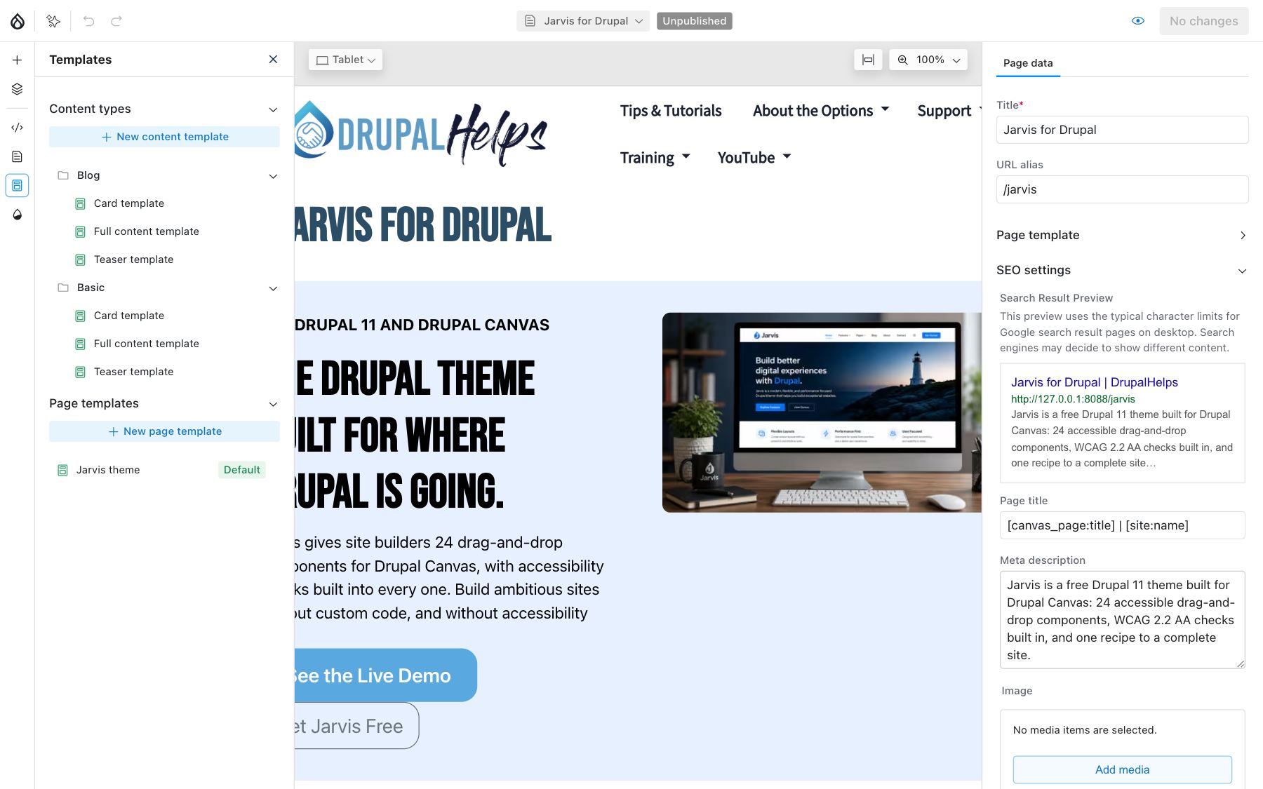
Template
Where it's used
Full content
The page a visitor sees when they open the post
Card
Grid listings, like the Blog page and the 3-card Blog block
Teaser
Stacked lists, like topic pages, with the image on the left
A template works like a Canvas page, with one difference: instead of typing a value into a component, you link the setting to a field. The Card's image is linked to the Hero Banner, its text to the Abstract. Canvas previews the template with a real post, so you see actual content while you work.
Before you publish a template: Preview it with 2 or 3 different posts: one with a long title, one with no image. A template that looks perfect with one post can break with another.
The rule: Edit the template when every post should change. Edit the post when only one should.
8. Images, documents and video
Every image, PDF and video lives in the media library, and you reuse it from there. Upload once, place it anywhere.
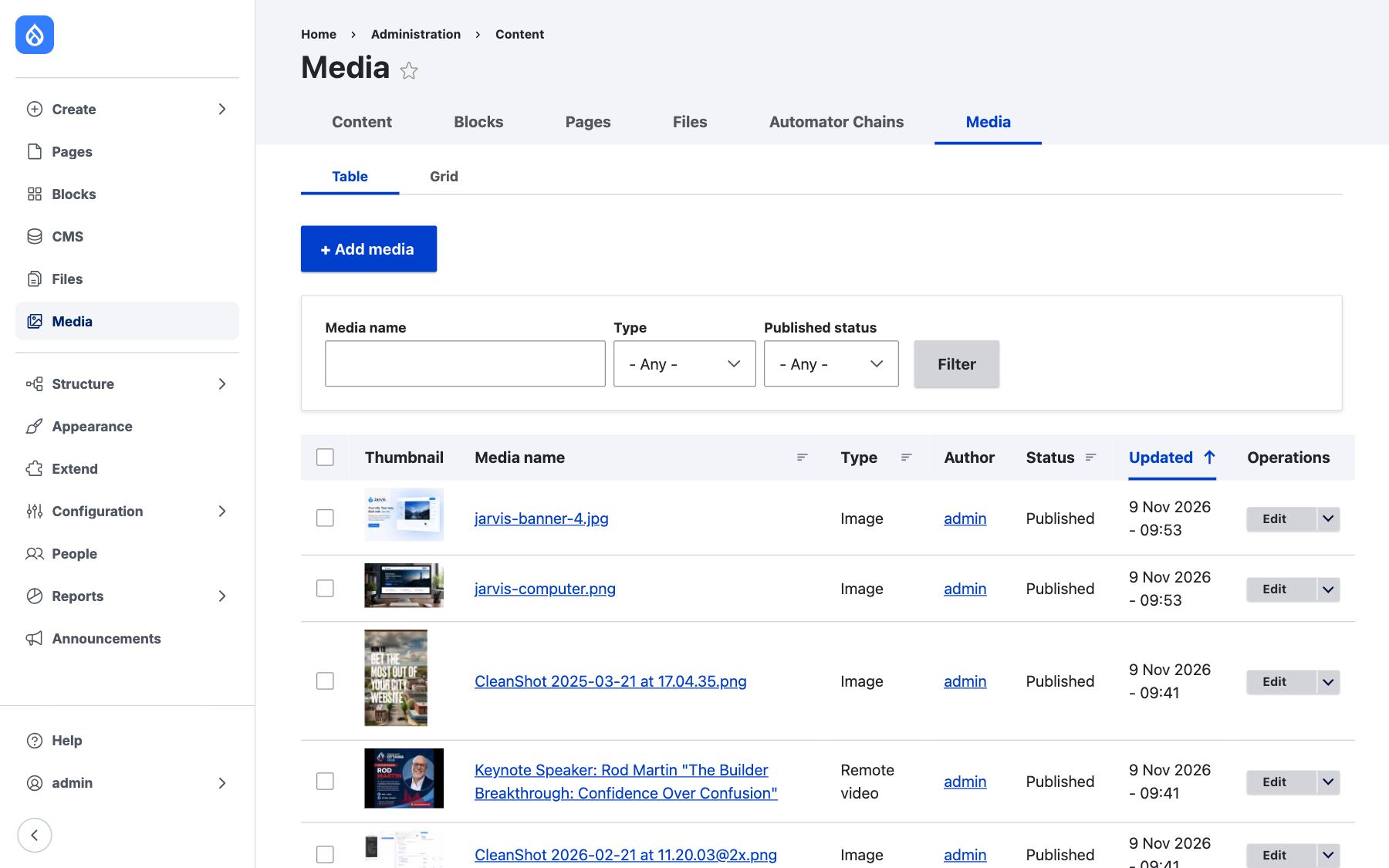
- Images. Upload, write the alt text, and set the focal point: click the part of the photo that matters, and Jarvis keeps it in frame when the image is cropped for a card or banner.
- Documents. PDFs and other files, for download links and file fields.
- Remote video. Paste a YouTube or Vimeo link. Turn captions on at YouTube or Vimeo.
- Video. An uploaded video file. Add a captions file (WebVTT,
.vtt) in the Video component.
Alt text is written once, on the media item, and every placement uses it. When one placement needs different wording, components with an image have Override alt text. For a purely decorative image, tick Decorative image so screen readers skip it.
The rule: Write the alt text when you upload, not when you place. You'll never be in a better position to describe the image.
9. Menus
The main navigation is a menu you manage in the admin, not on the page.
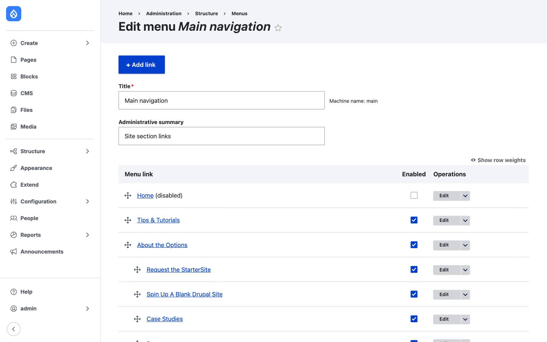
- Go to Structure, then Menus, and edit Main navigation.
- Click Add link, enter the title and the page, and save.
- Drag links to reorder them. Drag a link under and to the right of another to make it a dropdown item.
- Untick Enabled to hide a link without deleting it.
For a blog post or Basic page, you can also add the menu link from Menu settings in the sidebar of its edit form.
Jarvis marks the page a visitor is on in the menu, for sighted visitors and screen readers alike, and every dropdown works from the keyboard. You don't set anything for that.
The rule: Keep the top level short. Every extra item is one more thing a visitor has to read before they find what they came for.
10. Your brand: colors, fonts and logo
Your brand is set once, in the theme settings, and every component follows it. Go to Appearance, then Settings, then Jarvis.
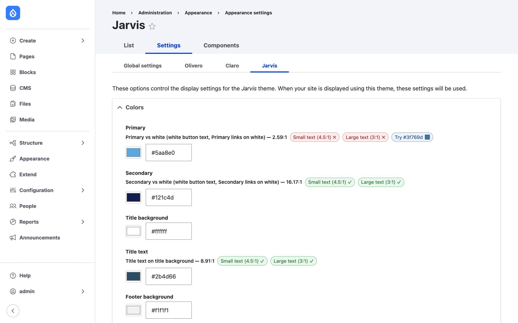
- Colors. Primary and Secondary drive buttons, backgrounds and accents. There are settings for the title area, footer and backgrounds too.
- Fonts. Choose Google Fonts for headings, body text and navigation. Jarvis downloads them and serves them from your own site, so visitors' browsers never call Google.
- Sizes. The base text size and each heading size.
- Logo. Upload it on the same page, in the Logo image section.
Read the badges
Every color shows its contrast against the text that will sit on it, checked against WCAG 1.4.3 Contrast (Minimum), Level AA: 4.5:1 for normal text and 3:1 for large text. A green check passes. A red cross fails.
Take the screenshot above. The Primary color, a light blue, scores 2.59:1 against white. That fails for both small and large text, so every white-text button in that color is hard to read. The fix isn't in the content. It's a darker shade of the same blue, chosen right here.
The rule: If a badge is red, change the color. No amount of careful writing makes low-contrast text readable.
11. Forms, sharing and search
Forms
Forms are built with Webform, under Structure, then Webforms. To put one on a Canvas page, drag the Webform block from the Library and choose the form. Jarvis styles the fields and buttons to match your brand, and spam protection is already on.
Share buttons
Drag Share from the Library to the end of a page. Tick the networks you want and pick a shape. The buttons sit centered with no visible label, and screen readers still announce them as "Share". To add it to every blog post, put Share in the Blog's Full content template and link its Share text to the Title. DrupalHelps.com does exactly that.
Search and social
Each Canvas page has SEO settings in Page data: the page title, the meta description, and an image for social shares. Blog posts and Basic pages have the same thing under Meta tags. The defaults are sensible. The meta description is the one worth writing yourself, because it's the sentence people read before they decide to click.
The rule: Write the meta description for a person scanning results, not for a search engine.
12. Accessibility: your part
Jarvis handles a lot of accessibility for you. It can't handle all of it, and knowing where the line falls is the whole job.
Jarvis handles
You handle
Text contrast over images: overlays darken until the text passes WCAG AA
Alt text that says what the image means
Contrast checks on your brand colors
Headings in order, without skipping levels
Keyboard-friendly menus and visible focus
Link text that says where it goes
Screen reader names on buttons, like each card's "Read more"
Captions on your videos
Turning animation off for visitors who ask their device to reduce motion
Plain language, short paragraphs, real lists
The checklist
- One H1 per page. On a Canvas page the page title is the H1. Every heading you add starts at H2.
- Don't skip heading levels. H2, then H3, then H4. Cards, heroes and sections have a Heading level setting. Set it one level below the heading above it. Screen reader users move around a page by its headings, and a skipped level reads as a missing section.
- Write alt text that does a job. "Rod teaching a room of 20 site builders" tells the reader something. "Photo of people" doesn't. Screen readers already announce that it's an image, so never start with "Image of".
- Make every link say where it goes. "Download the 2026 training schedule (PDF)", never "click here".
- Caption every video. WCAG 1.2.2 Captions (Prerecorded), Level A.
- Run the checker before you publish. Logged-in editors see the Editoria11y toggle at the bottom right of every page. It flags missing alt text, skipped headings and vague links in place. Publish with zero flags.
The cost is lopsided. Alt text takes seconds to write while the image is in front of you. Finding and fixing it later, across a whole site, takes far longer. The theme can't write it for you, and nobody fixes it once for everyone.
The rule: If it's in the editor, it's yours. If it's in the theme, report it, and it gets fixed once for every page.
13. When something looks wrong
What you see
What's going on
What to do
Visitors don't see your change
It's saved but not published
Click Review changes and publish it
A card has no text under the title
The post has no Abstract
Edit the post and write one
Text over a photo is darker than you set it
Jarvis raised the overlay so the text stays readable
Pick a calmer photo, or accept the darker overlay
A color you picked doesn't take on a section
It would fail contrast there, so Jarvis falls back to a safe color
Choose a color the section supports
Every post changed at once
Someone published a template
Open Templates and review the last change
Columns stack on a phone
That's on purpose: side-by-side columns are unreadable at phone width
Nothing. Check the order still makes sense stacked.
A component you need isn't in the Library
It may be disabled, or it may be a block
Search the Library by name, or ask your site builder
The rule: When in doubt, check the publish button, then the template. Most surprises are one or the other.