Lawsuits involving ADA (Americans with Disabilities Act) and small businesses are up 37% in 2025 - mostly directed to small online sellers (https://www.clym.io/blog/accessibility-lawsuits-2025-small-business-web…)
The Risk is Real
Currently, small retailers of Christmas Trees (yes - you read that right) are being targeted by a law firm and settlements are in the thousands.
If you're concerned, and you should be, here are six things to look for on your own website:
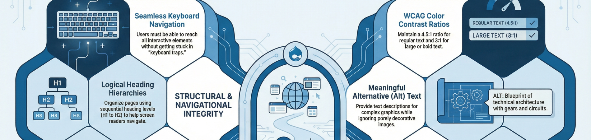
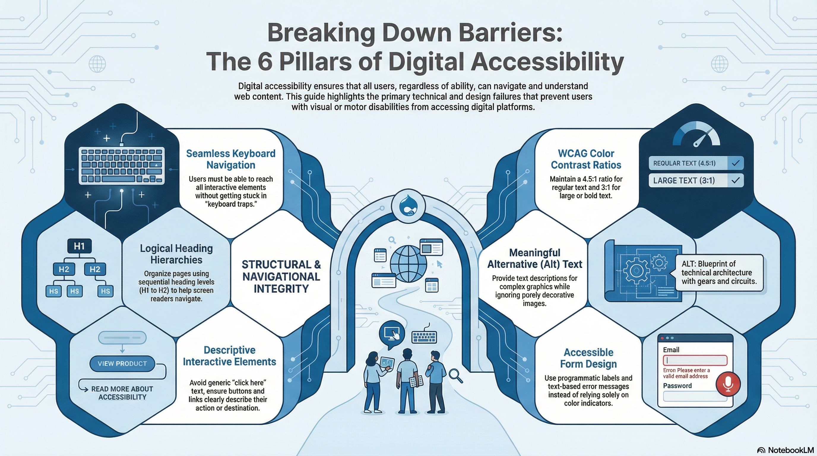
Six Pillars of Accessibility
1. Missing or Inadequate Alt Text. Failing to provide meaningful text descriptions for images is one of the most frequently cited accessibility violations. Common problems include missing descriptions entirely, using generic terms like "photo" or "image," failing to describe complex graphics, or unnecessarily describing purely decorative images. Without alt text, screen reader users cannot understand the visual content of the page.
2. Keyboard Navigation Failures. Many websites rely entirely on mouse-based navigation, making them unusable for individuals with motor or visual disabilities who rely on a keyboard. Key issues include users being unable to reach all interactive elements (like menus, popups, or modals) with a keyboard, lacking visible focus indicators to show where the user is on the page, or encountering "keyboard traps" where a user gets stuck on a specific element and cannot tab away.
3. Inaccessible Form Fields. Online forms—such as checkout pages, newsletter signups, and contact forms—are critical for business but frequently fail accessibility standards. Issues arise when forms lack proper visible and programmatic labels, leaving screen reader users to guess what information is required. Additionally, error messages that rely solely on color (like a red outline) rather than text descriptions prevent users from knowing how to fix their mistakes.
4. Poor Color Contrast. Text and background color combinations that do not have a sufficient contrast ratio are a common violation, making it difficult or impossible for users with low vision or color blindness to read important content. To meet standard WCAG guidelines, regular text must have a minimum contrast ratio of 4.5:1 against its background, while large text (18pt or 14pt bold) requires a 3:1 ratio.
5. Improper Heading Structures. Headings are essential for screen reader users to understand page organization and navigate efficiently. Common barriers include skipping heading levels (e.g., jumping directly from an H1 to an H3), using multiple main headings (H1) on a single page, using headings purely for visual styling, or lacking a heading structure altogether.
6. Unclear Interactive Elements (Buttons and Links). Buttons, links, and other interactive controls often lack clear, accessible names or text. If a clickable element (such as a linked image or an icon) does not have descriptive text, a screen reader cannot tell the user what action the button performs, simply reading it aloud as "button" or "link". Furthermore, using generic link text like "click here" or "read more" fails to describe the link's destination out of context.
Two really great resources
If your website uses Drupal - install and use Editoria11y - https://drupal.org/project/editoria11y
Test your website with this free checker: https://wave.webaim.org/report (or use the chrome/brave extension)
In July we'll be presenting this (and more) information to the Mid America Christmas Tree Association at their annual meeting - https://www.midamericachristmastree.com
I'm re-working their site for them right now - https://mact.drtr.site